Overview
This research repository serves as an internal tool for R&D employees to reference user research and customer information. Users are able to add new posts that link to Jira, Confluence, Github, Stack Overflow, and other internal documentation. They are able to add tags to posts and sort through categories.
Role: Lead researcher and UX/UI Designer
Platform: Web
Tools: Adobe Illustrator, Adobe XD, Figma
Duration: 3 months
Research
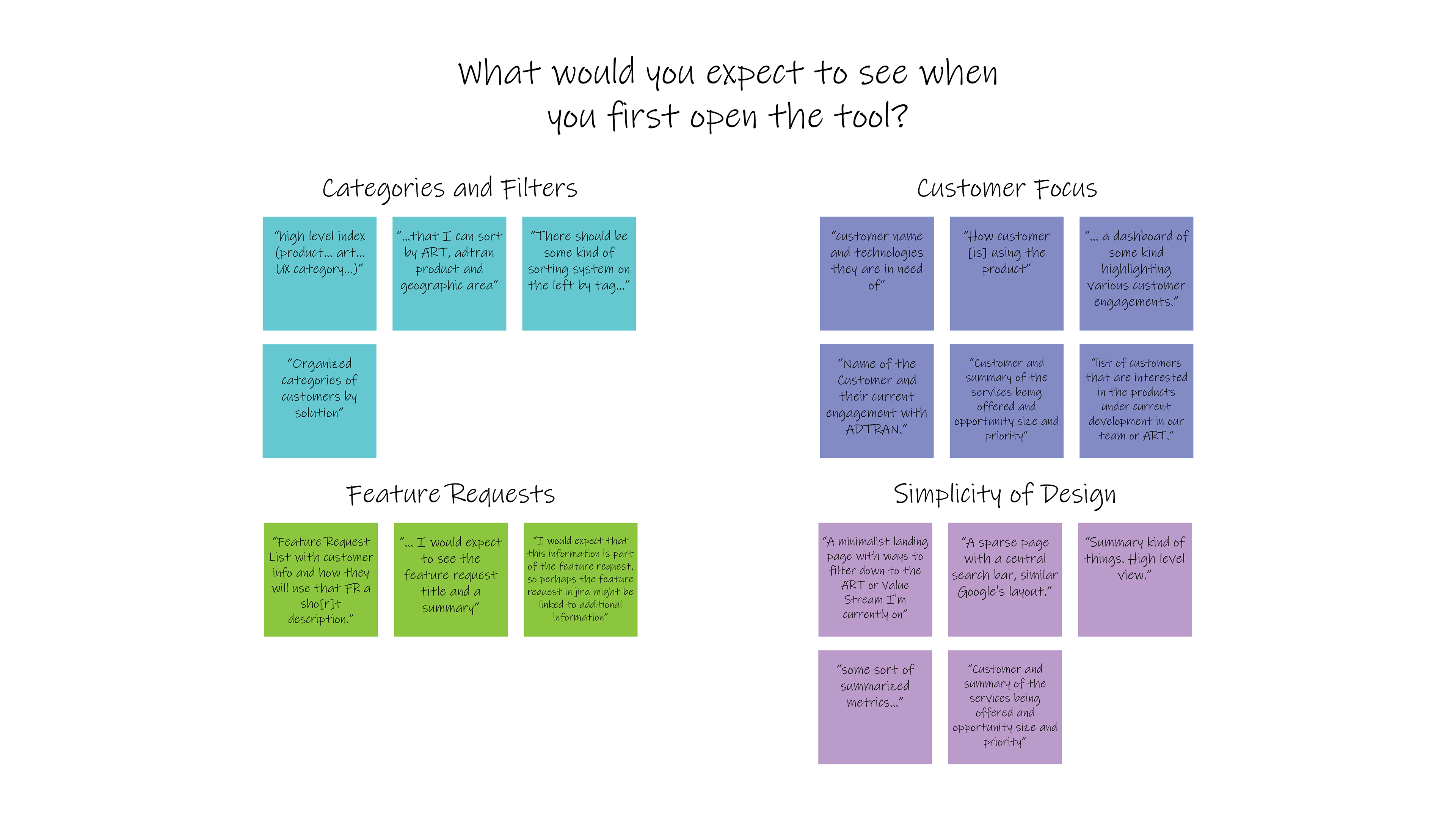
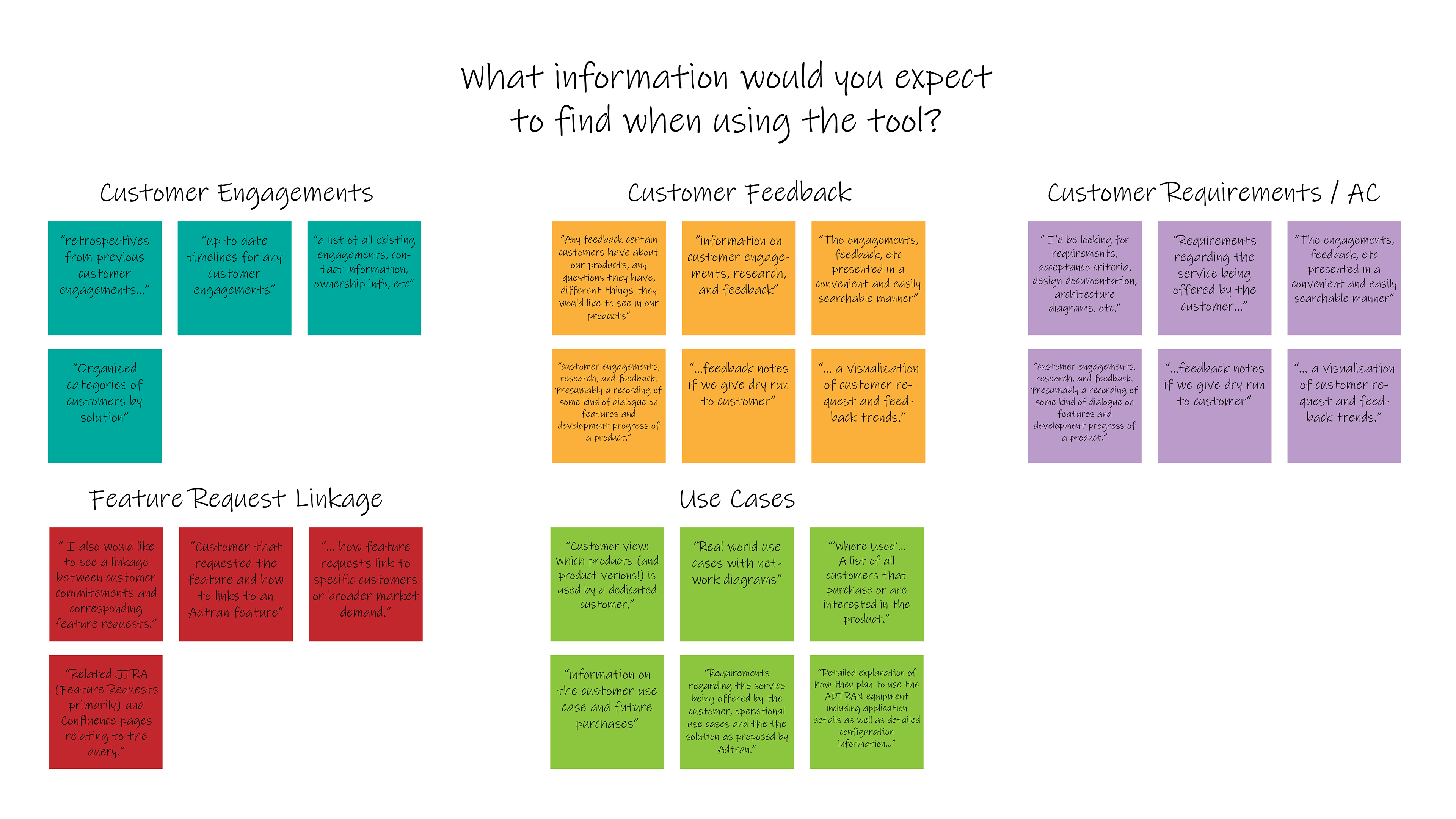
Learning more about our user base. Before the team launched the minimum viable product (MVP), they wanted to gather the expectations and needs of the potential users. They set up an online survey and gathered the company's development members to take the survey.
Results. We received 69 responses from within the R&D team. Based on the responses, there was a demand for a customer focus and high level indexing. Users showed dissatisfaction with the results garnered by the Confluence search engine.
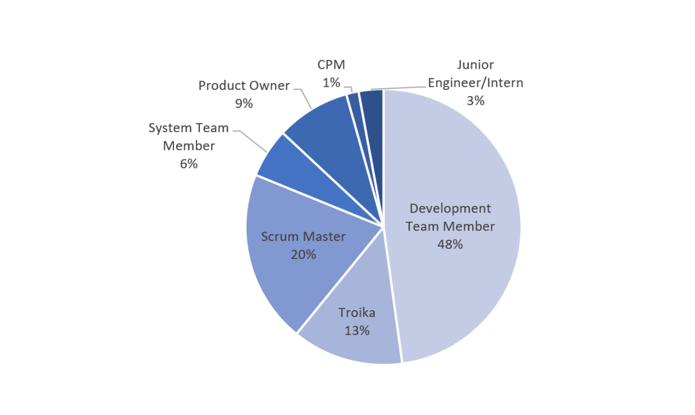
Pie chart of the survey respondents by roles
Affinity Mapping
Grouped responses by questions. I decided to pursue a design that would entice users to search, but not overwhelm them with information. The surveyors showed major interest in easily locating the documentation of customer interactions and feedback. I took this into consideration when iterating on the MVP and created categories that would allow users to filter through customer data.
Wireframes
At the beginning of the design process, I created low-fidelity wireframes to help visualize the website's navigation.
I then used the low-fidelity wireframes to make a high-fidelity prototype to test with users. This was created using Adobe XD and I used Figma to user test.
I tested with a high-fidelity prototype to eliminate some user bias. The prototype was more interactive and representative of the design compared to the paper mockup.
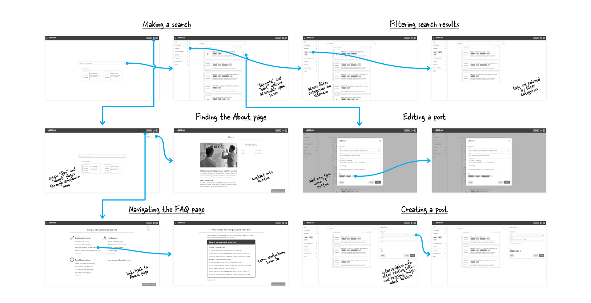
User flow of the high-fidelity prototype.
Usability Testing
Objectives and user backgrounds. I conducted in-person moderated usability tests on the high-fidelity prototype. I used Figma to observe where participants' pain points and hesitation occurred. The 7 participants were recruited through convenience sampling in ADTRAN's R&D department.
Insights.
• SUS Score: 85%
• NPS: 14
• Filters were hard for users to locate and the category names were too vague.
• The use of the "magic wand" button was unclear.
Key Takeaway. Although there were high scores in usability, users had concerns about the longevity of the website and did not feel the need to integrate the product into their existing workflows.
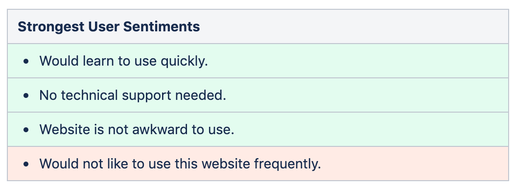
Strongest user sentiments collected with SUS.
Moving Forward
Keeping everything in mind, I researched how other companies' research repositories have achieved success and realigned the design to reflect what users would find engaging and useful.
Recognizing the Shortcomings
Referring back. I presented the results to the team and brought up the affinity maps from the survey data they collected before. We decided that the only way the website would be viable is if we pivoted from the original concept.
→ A library of insightful, curated articles
Pivoting. Instead of being a replacement for Confluence search (which majorly improved during the duration of usability testing), the Experience site needs to provide insightful information a place to live and cater its delivery towards R&D employees.
Determining the Information Architecture
I used the Object-Oriented UX method to determine the structure of content.
• I first immersed myself with the team's past documentation and affinity maps to gather common nouns or concepts.
• Then, I organized the concepts into umbrella terms and used a crow's foot diagram to show the relationships between screens.
• Using the diagram, I mapped the core content, metadata, and nested objects that would be on each screen.
• After, I created a wireflow that turned into a high-fidelity prototype in Figma.
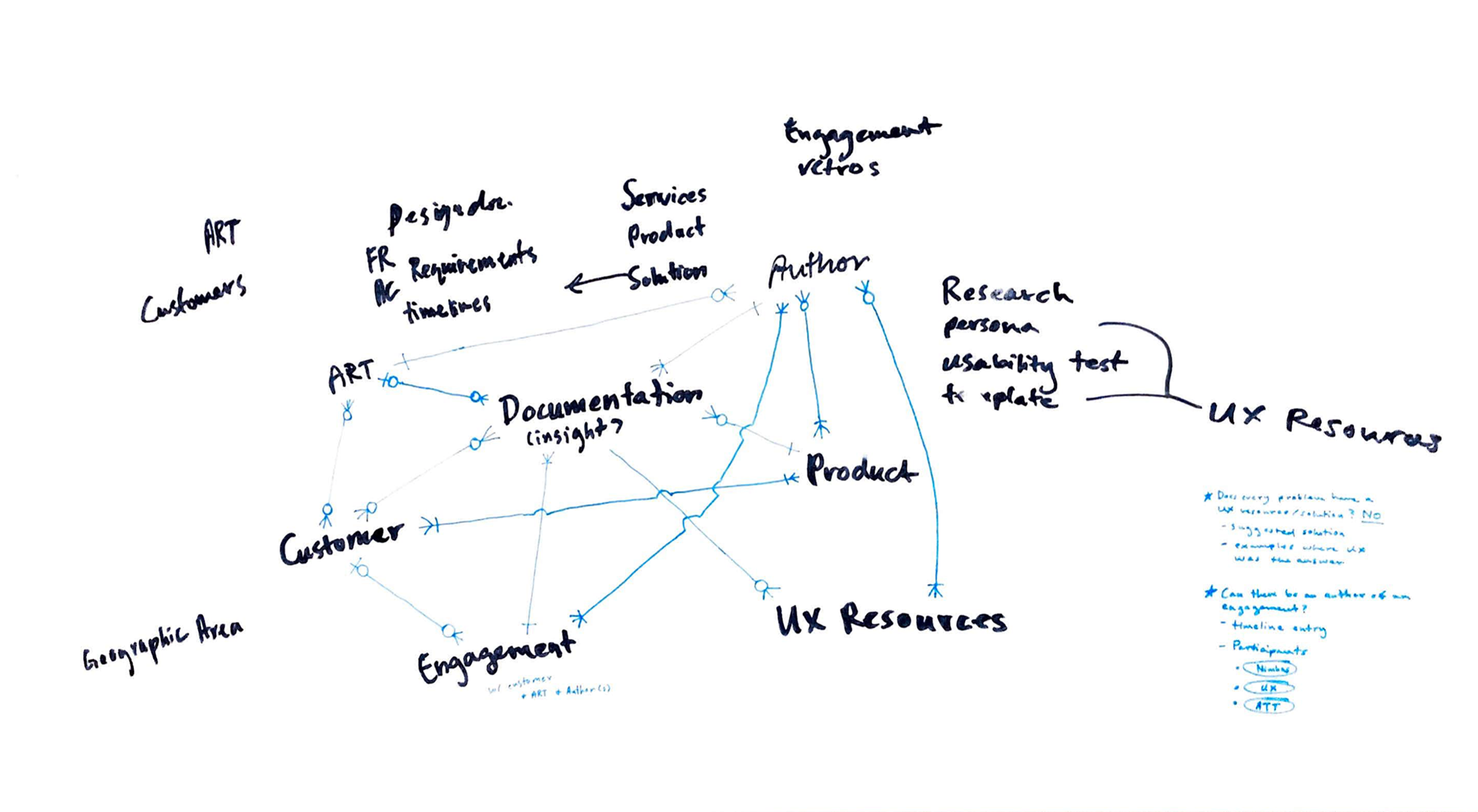
Crow's foot diagram of commonly used terms or objects.
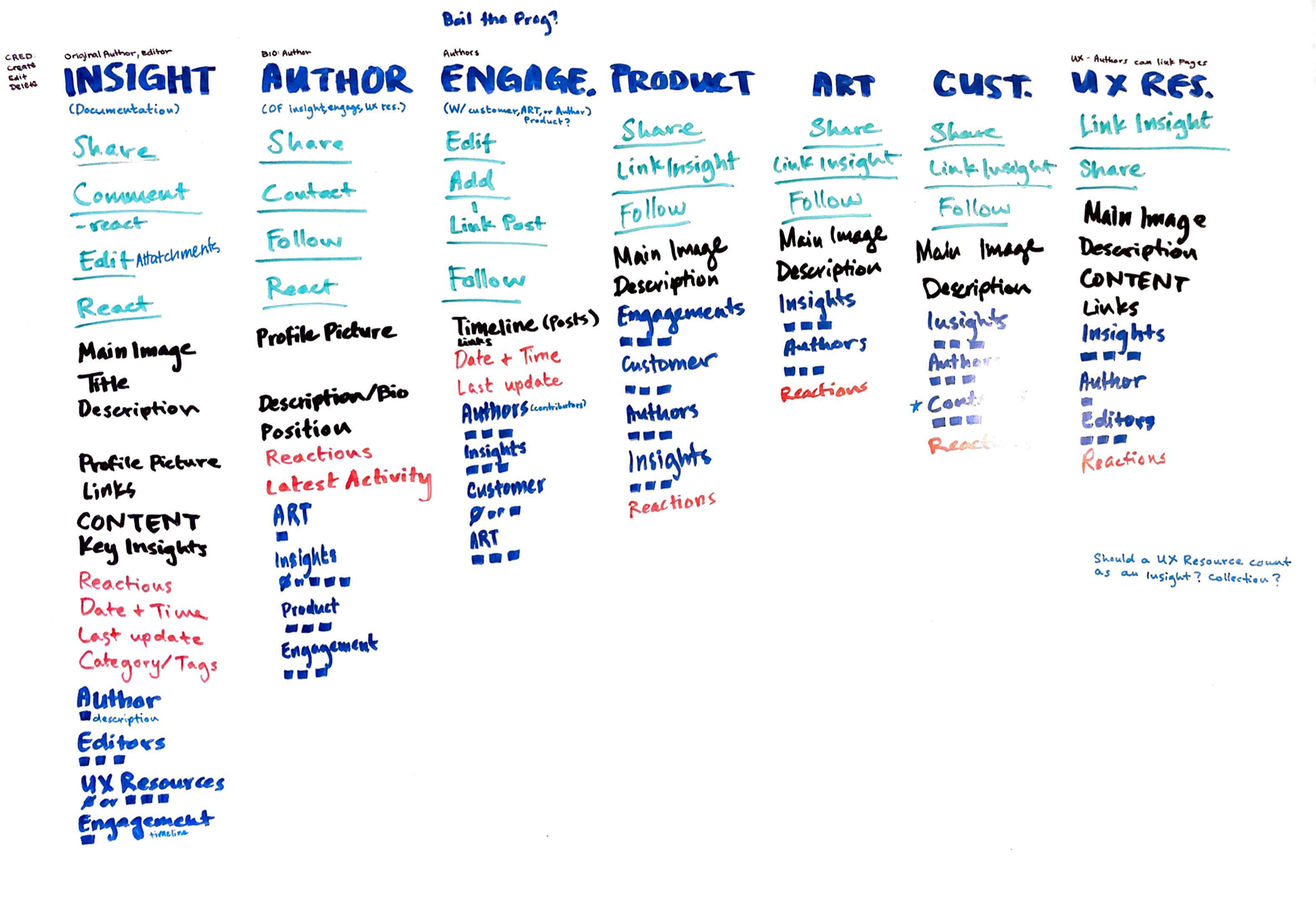
A map showing the core content, metadata, and nested objects that would be on each screen.
What's new?
Shifting to article format. To engage different user bases within R&D, the information needs to be accessible to all users. Instead of sifting "raw data" from Confluence, the user should be able to easily take information away from the article. For example, software engineers would probably not engage with a product's wireframes if they have no idea what wireframing even is.
Demonstrating practical user experience. According to R&D survey data, user experience is still an abstract concept for a majority of members within the department. UX methods can be linked to articles to show users real-life situations where they are used.
Recording engagements and use cases. Articles can now be linked to Engagements that show a history of interactions between parties whether it be between individuals, teams, or customers.
Incentives. By gamifying content contribution, user engagement can be increased. By publishing articles, writing comments, and receiving reactions, points can be accumulated to "launch" articles to the main page or possibly exchanged for company swag.
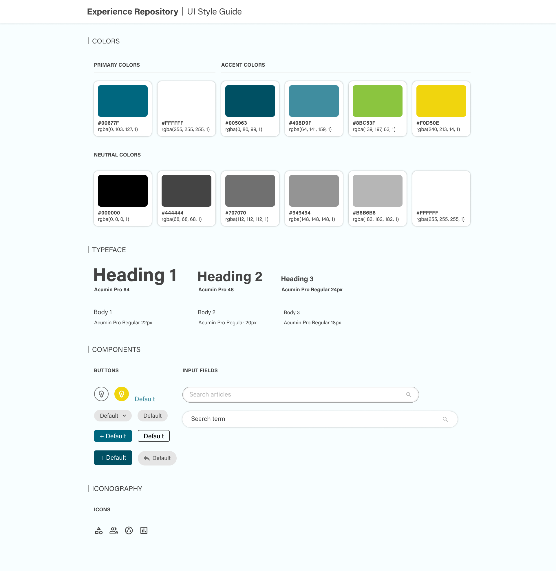
Style Guide
Taking into account user feedback, the original design seemed unaligned with ADTRAN's current websites. We decided to make the landing page more similar to the company's and utilized more colors from the existing corporate style guide. I chose a neo-grotesque sans-serif font family called Acumin that is both modern and easy-to-read.
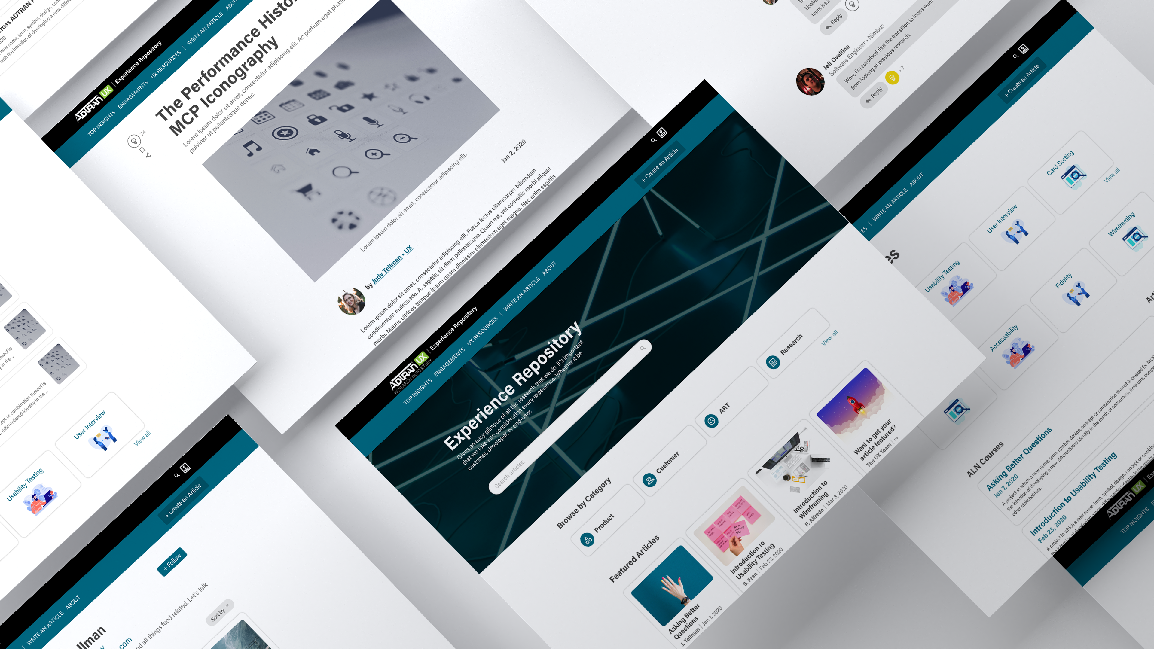
Final Product
Reflection
I completed this user study as a first-term co-op at ADTRAN Inc.'s UX team. I learned to not be afraid to jump into ongoing projects and how to realistically evaluate when to use different UX methods. I implemented Object-Oriented UX to determine the information architecture and to gain an understanding of how to put workshop experience into practice.
With more time, I would like perform ethnographic research to observe how users look for documentation and how they determine if a product should be integrated into their workflow. In the future, I would love to user test the new website and iterate further.