Overview
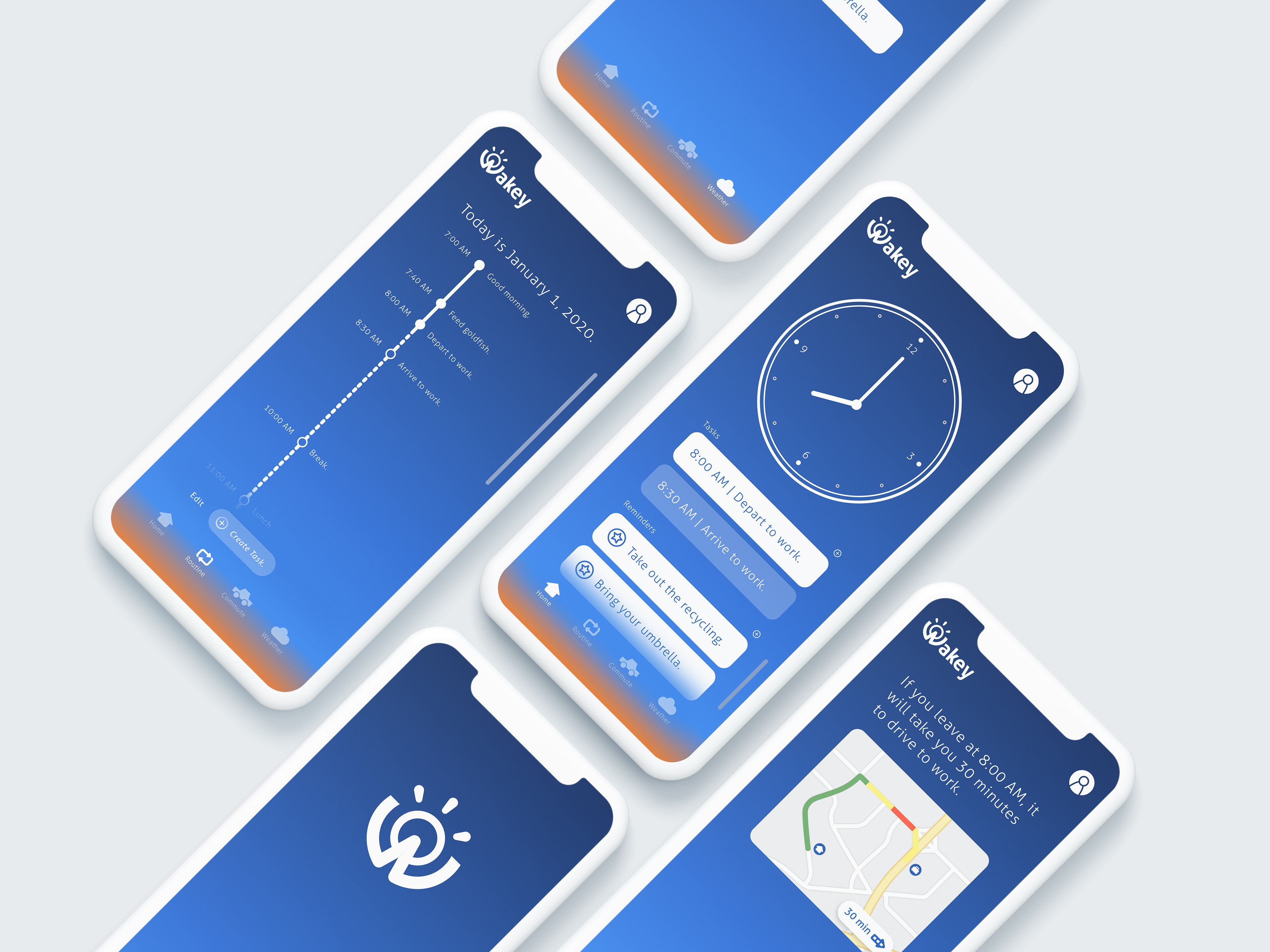
Wakey helps commuters get out the door on time by bringing every morning need to one app. It shows weather, commute, routine, reminders, and tasks. The user is also notified when regular commute time is extended.
The goal of this project is to lower the possibility of users becoming distracted by other apps and to have a nice ease into the day.
Role: Researcher and UX/UI Designer
Platform: iOS Mobile App
Tools: Adobe Illustrator, Adobe XD, Figma
Duration: 2 months
Problem: Commuters have to navigate through several different apps before leaving to work. This can become easily distracting.
Solution: Wakey allows users to input reminders and view relevant information all in one app so that they can have a stress-free commute.
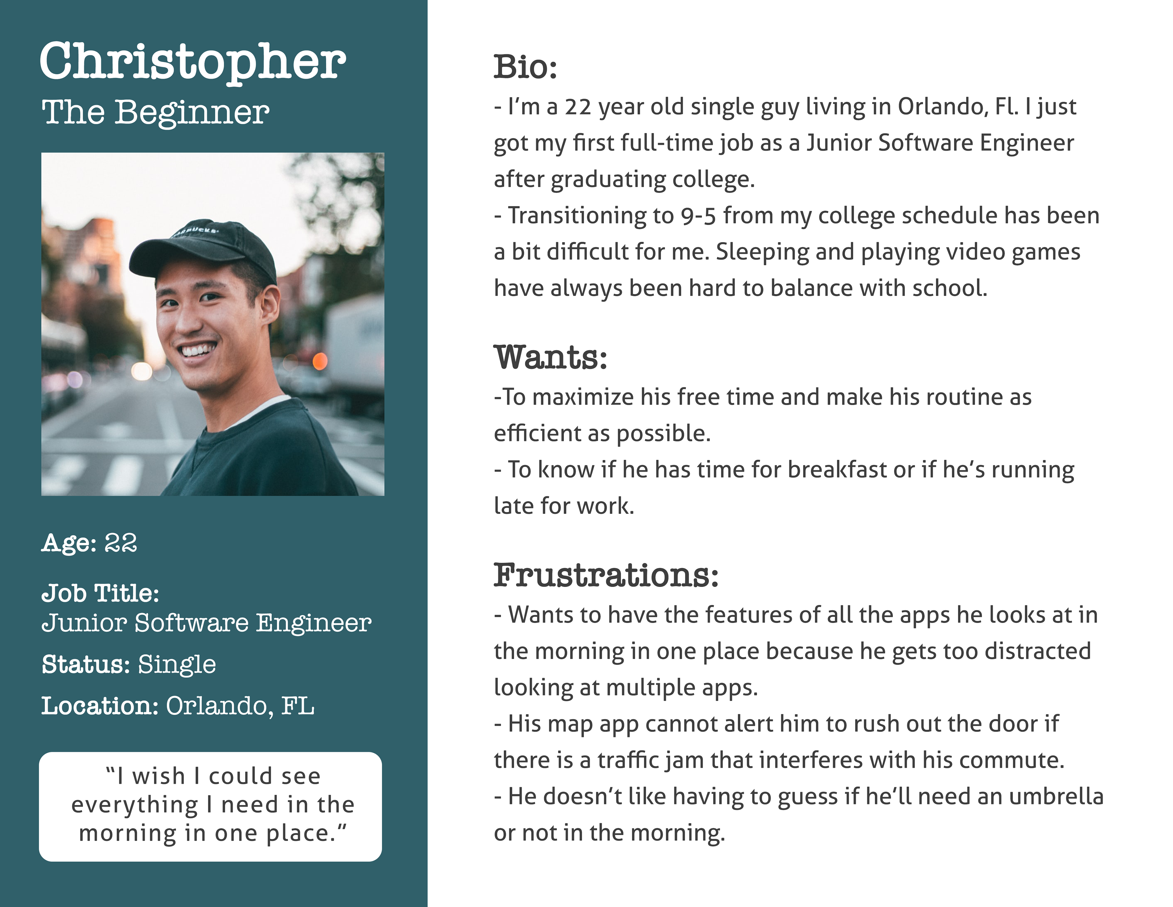
A persona based on user interviews conducted to learn user behaviors.
Persona
When developing the persona, I kept in mind user backgrounds and problems they might face in their daily lives.
I considered their wants and frustrations and that, in turn, affected how I designed the GUI.
Because they are looking to have a distraction-free morning, I wanted to try to communicate all the necessary information without the design feeling too cluttered.
Wireframes
At the beginning of the design process, I created low-fidelity wireframes to help visualize the app's navigation.
I then used the low-fidelity wireframes to make a high-fidelity prototype to test with users. This was created using Adobe XD and I used Figma to user test.
I tested with a high-fidelity prototype to eliminate some user bias. The prototype was more interactive and representative of the design compared to the paper mockup.
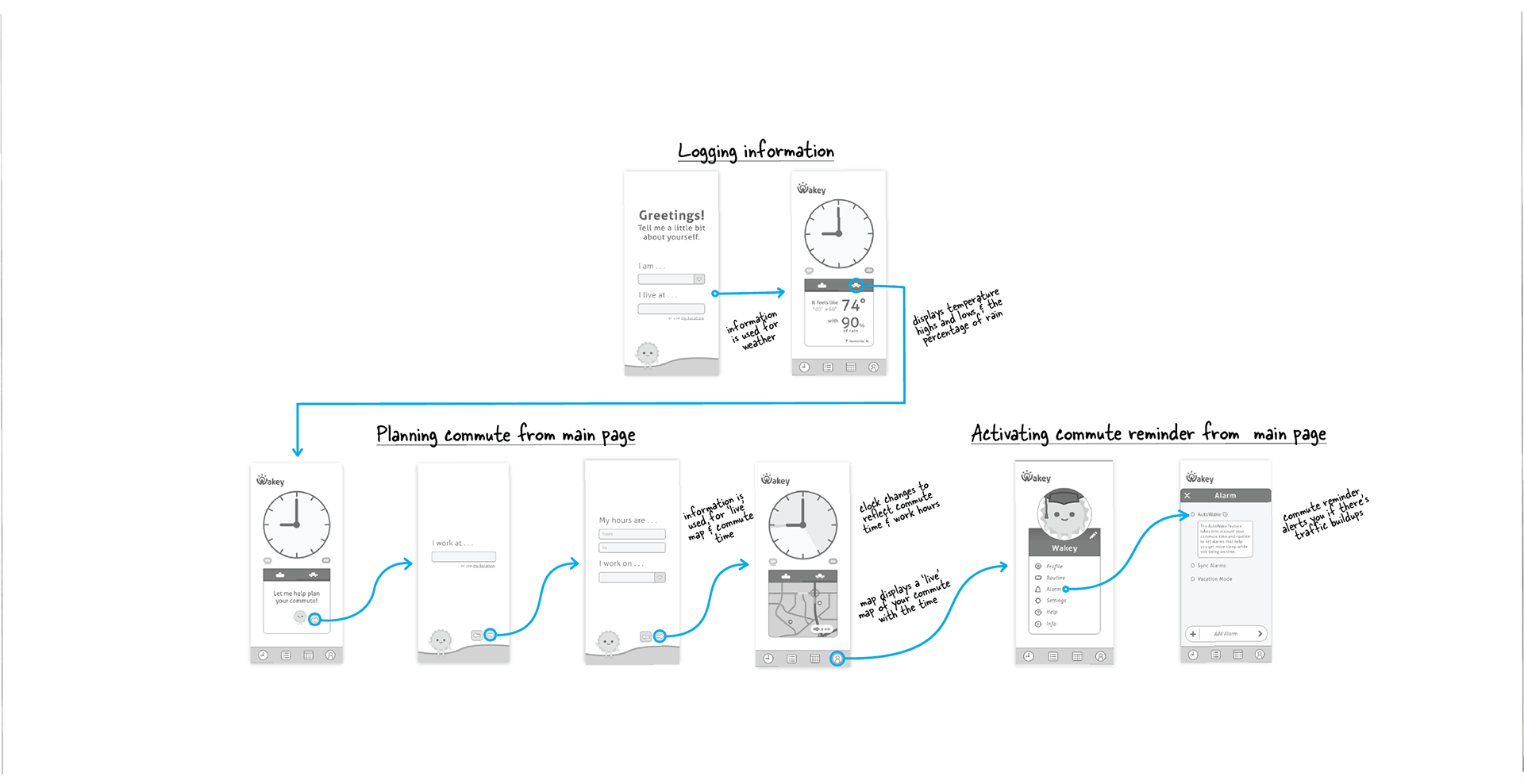
User flow of the high-fidelity prototype.
Usability Testing
Objectives and user backgrounds. I conducted remote moderated usability tests on the high-fidelity prototype. I used Figma to observe where participants' pain points and hesitation occurred. The 5 participants were recruited through convenience sampling. The average participant age was 19.25 years old.
Insights.
• Task success rate: 100%
• Ease-of-navigation rating: 80%
• Users had difficulty locating the car icon to plan their commute.
Solving the Shortcomings
Navigation. I moved the reminders and tasks to be displayed on the main page. Users had some trouble locating the commute button. So I chose to change the location of the commute and weather buttons on the main page to the menu bar to increase find-ability.
Referring back. I referred back to interviews and the user persona to realign the user experience vision. One worker said that they would benefit from being able to view their daily timeline and the persona wanted to be aware of his usage of time. Keeping that in mind, I added a menu button that enables the user to view their daily routine.
Final Product
Reflection
This case study started off as a project for my university's Introduction to Technical Writing class. I progressed from the original wireframes in my free time and here we are!
I learned that the user research and testing process isn't always linear. If I had more resources, I'd love to conduct a diary study where young millennials track their app use in the morning. In the future, I want to user test the high-fidelity prototype and iterate further.